Teachers and Examiners (CBSESkillEduction) collaborated to create the Data Analysis Class 11 Notes. All the important Information are taken from the NCERT Textbook Artificial Intelligence (417).
Data Analysis Class 11 Notes
Structured Data
Structured data is a standardized format for describing a page’s content and categorizing it. for example, Names, dates, addresses, credit card numbers, stock data, and other everyday items.
It is a clear structure, and is highly organized in a structured repository. In a relational database management system, it can be simply stored and found because it neatly fits into fixed fields and columns (RDBMS).
Common sources of structured data are:
a. Excel files
b. SQL databases
c. Medical devices Logs
d. Online Forms
Characteristics of Structured Data
a. High organized
b. Clearly defined
c. Easy to access
d. Easy to analyze
Examples of Structured Data
a. Name
b. Age
c. Gender
d. Address
e. Phone Number
f. Currency
g. Date
h. Billing info
Sources of Structured Data
a. SQL database
b. Spreadsheet
c. Sensors
d. Medical Device
e. Online Forms
f. Point of Sales Systems
g. Web and Server Logs
Data Analysis Class 11 Notes
Date and Time Datatype
Date and Time datatypes are used to hold values with both date and time information. Date-time information can be stored in a variety of formats.
String Data Type
An array of bytes (or words) that stores a succession of elements is frequently used to build the structured data type known as a string. A string can contain [A – Z], [as z], [0 -9], and [all special characters], yet they are all treated as though they were text because they can store alphanumeric data. There are also spaces in it. String information has to be enclosed in quotes (“”or”).
Examples:
Address = “9th Floor, SAS Tower, Gurgaon”
“Hamburger”
“I ate 3 hamburgers”.
Categorical Data Types
The term “categorical data” also refers to a collection of information that may be categorised into categories, such as the report cards for all students. Because it may be categorised based on the variables included in the report card, such as class, subjects, sections, school-house, etc., this data is known as categorical data.
There are four different type of Categorical Data Type –
a. Nominal
b. Continuous
c. Ordinal
d. Binary
Data Analysis Class 11 Notes
Representation of Data
The study of statistics focuses on gathering, organizing, analyzing, interpreting, and presenting data. The observations are turned into useful knowledge via data science. To complete this work, statisticians condense a lot of data into a format that is manageable and yields useful information.
Data representation techniques are broadly classified in two ways –
Non-Graphical technique – Tabular form and case form Large datasets should not be represented in this outdated format. When our goal is to make decisions after analysing a set of data, non-graphical techniques are less suitable.
Graphical Technique – Pie Chart, Bar graphs, line graphs, etc. The most typical visual representation of statistical data is in the form of points, lines, dots, and other geometric shapes. Due to time restrictions, it would not be feasible to describe the creation techniques for all sorts of diagrams and maps.
for example –
a. Line graphs
b. Bar diagrams
c. Pie diagram
d. Scatter Plots
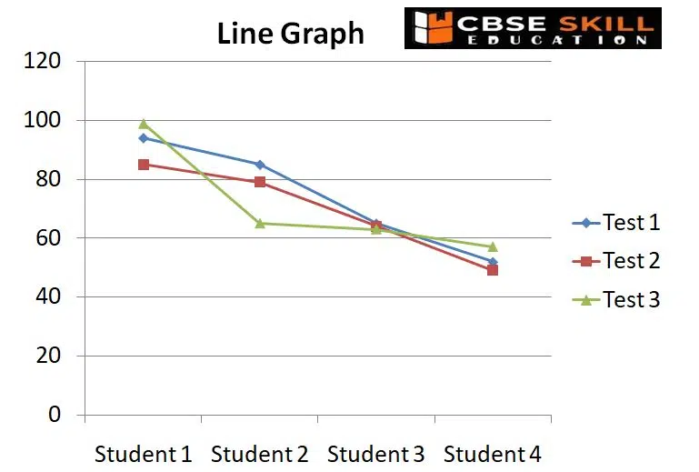
Line Graphs
A line graph, often known as a line chart, is a visual representation of data that is constantly changing over time.
A line graph connects the data using points that display a continuous change. Depending on the data points they represent, the lines in a line graph can either ascend or drop.
The advantages of using Line graph is that it is useful for making comparisons between different datasets, it is
easy to tell the changes in both long and short term, with even small changes over time.
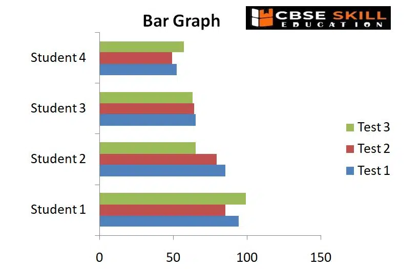
Bar Diagram
The bars in a bar graph, commonly referred to as a bar chart or bar diagram, are used to compare data between categories. The bar’s length is inversely proportional to the value it stands for. Simply put, the value a bar represents increases with length. The graph’s bars, which can run either horizontally or vertically, are all the same width.
Following rules should be observed while constructing a bar diagram:
(a) The width of all the bars or columns should be similar.
(b) All the bars should be placed on equal intervals/distance.
(c) Bars may be shared with colours or patterns to make them distinct and attractive.
Bar Diagram helpful for comparing data, offer a visual representation for quick comparison of amounts in various categories, and make determining relationships simple. Large changes over time are also depicted in bar graphs.
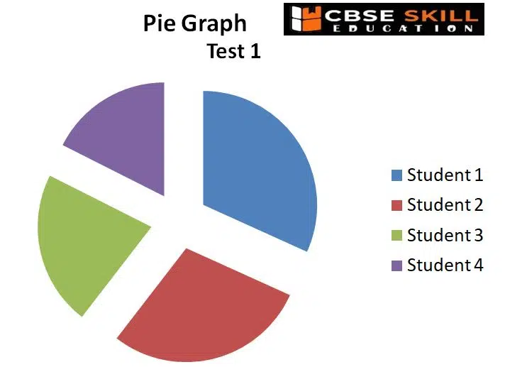
Pie Chart
A circular graph with numerous parts or sections is known as a pie chart. Each sector (segment) of the pie represents the relative size, i.e., the percentage or contribution that each category made to the overall pie. Each part of the diagram resembles a slice of a pie, and the whole thing looks like one. Data from a short table can often be visualised using pie charts.
The advantages of a pie chart is that it is simple and easy-to-understand and provides data comparison at a glance.
Scatter Plots
Scatter plots are used to show the relationship between two variables (or aspects) for a collection of paired data. They consist of a set of data points plotted along the x and y axes. The various shapes that the data points take tell a tale all their own, most frequently indicating the connection (positive or negative) in a lot of data.
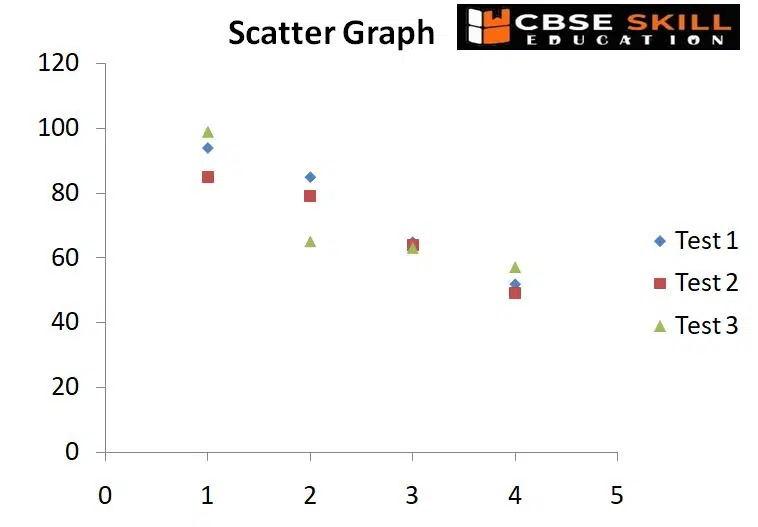
Types of Correlation
The statistical concept of correlation describes how closely two variables move in parallel with one another. Two variables are considered to have a positive correlation if they move in the same direction. They have a negative correlation if they travel in the opposite directions.
Positive Correlation – Both variables are seen to be moving in the same direction. In other words, with the increase in one variable, the other variable also increases.
Negative Correlation – Both the variables are seen to be moving in opposite directions. While one variable increases, the other variable decreases.
Exploring Data
Exploring data entails “getting to know” the data, including its values and their typical, unusual, focused, or extreme characteristics. More significantly, throughout the exploration process, one has the chance to spot and fix any issues with their data that could perhaps influence the findings they come to during analysis. This is the first step in data analysis and involves summarizing the main characteristics of a dataset, such as its size, accuracy, initial patterns in the data and other attributes.
Data Analysis Class 11 Notes
Case, Variables and Levels of Measurement
Cases and Variables
A variable is a quality that may be measured and have several values. Or, anything that varies depending on the circumstance. In contrast, a constant in a research study is the same in every situation. Case a sampling point for an experimental unit.
Cases are nothing more than a collection of objects, a dataset is said to consist of cases.
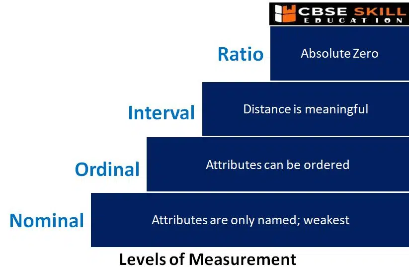
Levels of Measurement
The level of measurement refers to the method used to determine a set of data. Data cannot be treated equally in all cases. It makes logical to categorise data sets using several standards. Some are qualitative while others are quantitative. There are discrete and continuous data sets. The type of qualitative data can be nominal or ordinal. Additionally, interval and ratio data can be separated into two types.
Data Analysis Class 11 Notes

Data Analysis Class 11 Notes

Nominal Level
Nominal-level data are qualitative data. The four seasons of winter, spring, summer, and autumn are examples of nominal variables, as are product categories like Mercedes, BMW, or Audi. Since they are not numbers, they cannot be ranked or utilised in calculations. The easiest or lowest of the four ways to characterise data is the nominal level of measurement.
Ordinal Level
Ordinal data is composed of groups and categories that are arranged in a specific order. For instance, suppose you were asked to give a restaurant meal a rating and you had the choice between unpleasant, unappetizing, just acceptable, tasty, and delicious.
Although the restaurant utilised words rather than numbers to judge the quality of its meals, it is obvious that these preferences are ranked from low to high or from negative to positive, making the data qualitative rather than ordinal. The disparity between the data, however, cannot be quantified. Ordinal scale data cannot be used in calculations, much like nominal scale data.
Interval Level
Because it has a clear ordering, data measured using the interval scale is similar to data recorded using the ordinal scale, but there are some differences as well. Even though the data does not have a starting point, or a zero value, the differences between interval scale data can still be measured.
Ratio Scale Level
Similar to interval scale data, ratio scale data has a 0 point and can be used to calculate ratios. For instance, the results of four multiple-choice questions on the final test in statistics were 80, 68, 20, and 92 (out of a possible 100). The grades are produced by a computer. The numbers 20, 68, 80, and 92 can be arranged from lowest to highest, or vice versa. The variations in the data are significant. The score 92 is 24 points higher than the score 68. One can compute ratios. The lowest score is zero. 20 divided by 4 equals 80. An 80 is four times better than a 20, for example.
Data Analysis Class 11 Notes
Data Matrix and Frequency Tables
What is Data Matrix?
The Data Matrix is a tabular representation of the cases and variables utilised in your statistical analysis. In a data matrix, each row denotes a case and each column a variable. There could be hundreds, lakhs, or even more examples in a complete data matrix.
Frequency Tables
The number of times a specific data value happens (occurrences) in a given set of data is the frequency of that data value. In cricket, if four players each score 90 runs, the score of 90 is said to occur four times. ‘f’ is frequently used to denote a data value’s frequency.
Graphs and Shapes of Distributions
Statisticians or machine learning engineers often want to summarize the data they have. They can do it by various available methods like data matrix, frequency tables or by graphical representation. When graphed, the data in a set is arranged to show how the points are distributed throughout the set.
Data Analysis Class 11 Notes
Mean, Median and Mode
Mean
Imagine yourself returning home with your report card after the announcement of your final grades in class. Your parents will ask, “What is your average score?” regarding your grades and general performance. In actuality, they’re looking for your MEAN score.
The most often used and well-known index of central tendency is the mean (or average). The mean is determined by dividing the total number of values in the data set by the number of values in the data set. The mean in this situation is calculated by adding up all of your marks and dividing them by the number of topics.
M = ∑ fox / n
Where M = Mean
∑ = Sum total of the scores
f = Frequency of the distribution
x = Scores
n = Total number of cases
Median
The value of an observation for which half are larger and half are smaller is known as the median. The mean of the two middle points is calculated if the number of data points is even. For the median difference, the median for two samples is calculated, and then their difference is calculated.
For a grouped data, calculation of a median in continuous series involves the following steps:
(I) The data arranged in ascending order of their class interval
(ii) Frequencies are converted into cumulative frequencies
(iii) Median class of the series is identified
(iv) Formula used to find actual median value
Mode
Another crucial indicator of a tactical series’ primary tendency is its mode. In the data series, it is the value that appears the most frequently. The most frequent score in our data set is the mode. It stands in for the highest bar on a histogram or bar chart. Therefore, you might occasionally think of the mode as the most common choice.
Data Analysis Class 11 Notes
Z – score (For Advance Learners)
The Z-score provides us with a notion of how far our particular data point is from the mean. Technically speaking, it’s a measurement of how far the data point deviates from the population mean by standard deviations. If a value is above the mean, the z-score is positive; if it is below the mean, it is negative.
How do we interpret a z-score?
The value of the z-score tells you how many standard deviations your data point is away from the mean. If a zscore is equal to 0, it is on the mean.
A positive z-score indicates the raw score is higher than the mean average. For example, if a z-score is equal to
+1, it is 1 standard deviation above the mean.
A negative z-score reveals the raw score is below the mean average. For example, if a z-score is equal to -2.
Employability Skills Class 11 Notes
- Unit 1 : Communication Skills – III
- Unit 2 : Self-Management Skills – III
- Unit 3 : Information and Communication Technology Skills – III
- Unit 4 : Entrepreneurial Skills – III
- Unit 5 : Green Skills – III
Employability Skills Class 11 MCQ
- Unit 1 : Communication Skills – III
- Unit 2 : Self-Management Skills – III
- Unit 3 : Information and Communication Technology Skills – III
- Unit 4 : Entrepreneurial Skills – III
- Unit 5 : Green Skills – III
Employability Skills Class 11 Questions and Answers
- Unit 1 : Communication Skills – III
- Unit 2 : Self-Management Skills – III
- Unit 3 : Information and Communication Technology Skills – III
- Unit 4 : Entrepreneurial Skills – III
- Unit 5 : Green Skills – III
Subject Specific Skills Notes
- Unit 1: Introduction To AI
- Unit 2: AI Applications & Methodologie
- Unit 3: Maths For AI
- Unit 4: AI Values (Ethical Decision Making)
- Unit 5: Introduction To Storytelling
- Unit 6: Critical & Creative Thinking
- Unit 7: Data Analysis (Computational Thinking)
- Unit 8: Regression
- Unit 9: Classification & Clustering
- Unit 10: AI Values (Bias Awareness)