Data Literacy Class 11 AI NCERT Solutions – The CBSE has updated the syllabus for St. XI (Code 843). The NCERT Solutions are made based on the updated CBSE textbook. All the important information is taken from the Artificial Intelligence Class XI Textbook Based on the CBSE Board Pattern.
Data Literacy Class 11 AI NCERT Solutions
A. Multiple-choice questions
1. Which of the following best defines data literacy?
A) The ability to read and write data
B) The ability to find and use data effectively
C) The ability to analyse data using AI
D) The ability to collect and store data securely
2. What is the purpose of data preprocessing?
A) To make data more complex
B) To make data less accessible
C) To clean and prepare data for analysis
D) To increase the size of the dataset
3. How can missing data be handled in a dataset?
A) By ignoring it
B) By replacing missing values with estimates
C) By deleting rows or columns with missing values
D) By converting missing values to zero
4. Which of the following statements about the quantity of data needed for machine learning projects is true?
A) More data is always better for good predictions.
B) Small batches of data are sufficient for complex models.
C) Data quantity depends solely on the number of features.
D) Data diversity is not essential for model performance.
5. Which of the following is an example of a primary source of data collection?
A) Web scraping
B) Social media data tracking
C) Surveys
D) Kaggle datasets
6. What method of data collection involves direct communication with individuals or groups to gather information?
A) Observations
B) Experiments
C) Interviews
D)Marketing campaigns
7. Which of the following is an example of ratio scale data?
A) Grading students’ exam papers as “A,” “B,” “C,” “D,” and “F”
B) Measuring the temperature in Celsius
C) Rating a meal at a restaurant as “unpalatable,” “unappetizing,” “just okay,” “tasty,” and “delicious”
D) Recording the weight of a person in kilograms
8. What is the distinguishing feature of ratio scale data?
A) It involves categories without a specific order
B) It has a zero point and allows for ratios to be calculated
C) It involves categories with a strict order but no measurable differences between categories
D) It has a definite order, but the differences between categories cannot be measured
9. Which statistical measure is most suitable for data sets with evenly spread values and no exceptionally high or low values?
A) Mean
B) Median
C) Mode
D) Variance
10. What is the term used to describe the graphical or pictorial representation of data?
A) Statistical summary
B) Data organization
C) Data visualization
D) Data interpretation
B. Short answer questions:
1. Explain the concept of data literacy and its importance in today’s digital age.
Answer: Data literacy means being able to find and use data effectively. The importants of data literacy includes like collecting data, organizing it, checking its quality, analysing it, understanding the results and using it ethically.
2. What is data preprocessing?
Answer: Data preprocessing is a crucial step in the machine learning process aimed at making datasets more machine learning-friendly. It involves several processes to clean, transform, reduce, integrate, and normalize data.
3.What is data visualization and why is it important?
Answer: Data visualization helps to tell the stories of data using graphs, charts, or other visual methods. Data visualization helps to understand data more easily and makes it easier to make better decisions.
4. How does a line graph differ from a bar graph?
Answer: A line graph shows how the data changes over time. It allows us to visualize trends and changes in data points over time. Line graphs are suitable for data that can take on any value within a specific range. While a bar graph compares different categories of data, A bar chart or bar graph is a graph that presents categorical data with rectangular bars with heights or lengths proportional to the values that they represent.
5. When would you use a scatter plot?
Answer: Scatter plots visually represent relationships between two variables by plotting data points along both the x and y axes.
6. What is data?
Answer: Data literacy means being able to find and use data effectively. This includes skills like collecting data, organizing it, checking its quality, analysing it, understanding the results and using it ethically. Data may be structured, semi structured or unstructured.
7. What do you mean by web scraping?
Answer: Web scraping is automated tools to extract specific content and data from websites. For example, Scraping product information and prices from e-commerce websites for price comparison.
8. If a matrix has 6 elements, what are the possible orders it can have?
Answer: If the matrix has 6 elements, then the matrix has different possible orders, where the order of a matrix is defined by the number of rows and columns. The possible orders will be—
1 x 6 (1 row and 6 columns)
6 x 1 (6 rows and 1 column)
2 x 3 (2 rows and 3 columns)
3 x 2 (3 rows and 2 columns)
9. Construct a 3×2 matrix where each element is given by ???????????? = ???? ∗ ????
Answer:

10. Find the transpose of the matrix
C. Long answer questions:
1. Discuss the advantages and limitations of using a pie chart in data visualization. Provide examples to illustrate your points.
Answer: A pie chart is a circular graph divided into segments or sections, each representing a relative proportion or percentage of the total.
Advantages of pie chart
- Easy to understand
- Pie charts are visually appealing
- Pie charts is useful for comparing
Limitations of pie chart
- Pie chart is not suitable of too many chategories
- Pie chart is not ideal for displaying precise values
- Pie chart is not effective for showing changes overt time or trends.
2. Explain the terms mean, median and mode.
Answer: Central tendency” is stated as the summary of a dataset in a single value that represents the entire distribution of data domain (or dataset).
- Mean: In statistics, the mean can be estimated from a sample of examples drawn from the domain. It is a quotient obtained by dividing the total of the values of a variable by the total number of their observations or items.
- Median: The median is another measure of central tendency. It is positional value of the variables which divides the group into two equal parts, one part comprising all values greater than median and other part smaller than median.
- Mode: Mode is another important measure of central tendency of statistical series. It is the value which occurs most frequently in the data series. It represents the highest bar in a bar chart or histogram.
3. Explain the four levels of measurement.
Answer: The four levels of measurement are nominal, ordinal, interval and ration.
- Nominal data: Nominal data is qualitative data that groups variables into categories. This type of data cannot be used in calculations or in any order or rank., like colors of eyes, yes or no responses to a survey, gender (male and female), smartphone companies, etc.
- Ordinal level: Ordinal level in data refers to a type of measurement scale where data categories are ranked in a specific order, but ordinal scale data cannot be used in calculations. Ordinal data is made up of groups and categories that follow a strict order.
- Interval Level: An interval scale is one where there is an order and the difference between two values has a meaning. These distances between two values are known as intervals, and there is no zero in the interval scale.
- Ratio: Ratio scale data is like interval scale data, but it has a 0 point and ratios can be calculated. For example, the scores of four multiple choice statistics final exam questions were recorded as 80, 68, 20 and 92 (out of a maximum of 100 marks).
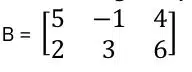
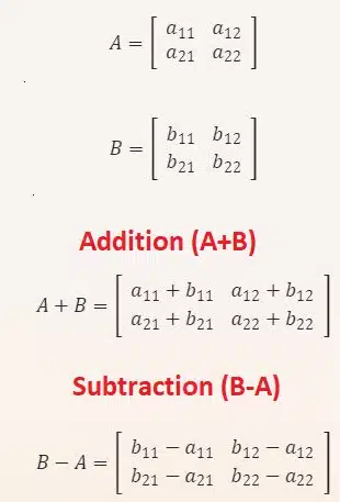
4. Given the matrices A and B. Calculate A + B and B – A.
Answer:
D. Python Programs
1. The ages of a group of people in a community are: 25, 28, 30, 35, 40, 45, 50, 55, 60, 65. Write a program to calculate the mean, median, and mode of the ages.
Answer:
import numpy as np
from scipy import stats

ages = [25, 28, 30, 35, 40, 45, 50, 55, 60, 65]

mean = np.mean(ages)
median = np.median(ages)
mode = stats.mode(ages)

print(f"Mean: {mean}")
print(f"Median: {median}")
print(f"Mode: {mode.mode[0]}")
2. A company recorded the daily temperatures (in degrees Celsius) for five consecutive days: 20°C, 22°C, 25°C, 18°C, and 23°C. Determine the variance and standard deviation of the temperatures.
Answer:
import numpy as np

temperatures = [20, 22, 25, 18, 23]

variance = np.var(temperatures)
std_dev = np.std(temperatures)

print(f"Variance: {variance}")
print(f"Standard Deviation: {std_dev}")
3. Plot a line chart representing the weekly number of customer inquiries received by a customer service center:
- Week 1: 150 inquiries
- Week 2: 170 inquiries
- Week 3: 180 inquiries
- Week 4: 200 inquiries
Answer:
import matplotlib.pyplot as plt

weeks = ['Week 1', 'Week 2', 'Week 3', 'Week 4']
inquiries = [150, 170, 180, 200]

plt.plot(weeks, inquiries, marker='o')
plt.title('Weekly Customer Inquiries')
plt.xlabel('Weeks')
plt.ylabel('Number of Inquiries')
plt.grid(True)
plt.show()
4. Plot a bar chart representing the number of books sold by different genres in a bookstore:
- Fiction: 120 books
- Mystery: 90 books
- Science Fiction: 80 books
- Romance: 110 books
- Biography: 70 books
Answer:
import matplotlib.pyplot as plt

genres = ['Fiction', 'Mystery', 'Science Fiction', 'Romance', 'Biography']
books_sold = [120, 90, 80, 110, 70]

plt.bar(genres, books_sold, color=['blue', 'green', 'red', 'purple', 'orange'])
plt.title('Number of Books Sold by Genre')
plt.xlabel('Genre')
plt.ylabel('Number of Books Sold')
plt.show()
5. Visualize the distribution of different types of transportation used by commuters in a city using a pie chart:
- Car: 40%
- Public Transit: 30%
- Walking: 20%
- Bicycle: 10%
Answer:
import matplotlib.pyplot as plt

transport_modes = ['Car', 'Public Transit', 'Walking', 'Bicycle']
percentages = [40, 30, 20, 10]

plt.pie(percentages, labels=transport_modes, autopct='%1.1f%%', colors=['blue', 'green', 'red', 'yellow'])
plt.title('Distribution of Transportation Types')
plt.show()
Disclaimer: We have taken an effort to provide you with the accurate handout of “Data Literacy Class 11 AI NCERT Solutions“. If you feel that there is any error or mistake, please contact me at anuraganand2017@gmail.com. The above CBSE study material present on our websites is for education purpose, not our copyrights. All the above content and Screenshot are taken from Artificial Intelligence Class 11 CBSE Textbook, Sample Paper, Old Sample Paper, Board Paper and Support Material which is present in CBSEACADEMIC website, This Textbook and Support Material are legally copyright by Central Board of Secondary Education. We are only providing a medium and helping the students to improve the performances in the examination.
Images and content shown above are the property of individual organizations and are used here for reference purposes only.
For more information, refer to the official CBSE textbooks available at cbseacademic.nic.in
1 thought on “Data Literacy Class 11 AI NCERT Solutions”